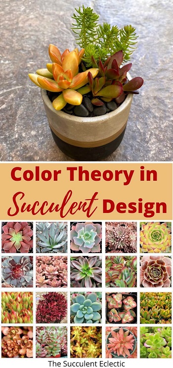
Today’s post is a looooong one, because there is so much to cover! So much of succulent design relies on the way we use color — the color of the succulents, the container, the top dressing and how we combine these colors. So far, we have looked at using color for repetition, as contrast and to create a focal point. But what if you’re uncomfortable using color? Or you’re unsure which colors complement one another well? Maybe, you’re even a bit “afraid” of using some colors? Some people have a natural flair for color — I truly envy that! But for the rest of us, basic color theory can help us to work with color more confidently. I’m going to show you how I made a succulent arrangement for full sun using color theory to make it come to life! Better yet, I’ll show you how to figure our color combinations for your own arrangements, using a color wheel. Are you ready to play with color?
{Please note, some links in this post may be affiliate links to sites that pay me a small commission if you click on the link and make a purchase. This commission is at absolutely no cost to you. I only recommend products and companies that I have worked with and truly love! ~Kat}
The Importance of Color
In this Post We'll Cover:
For sighted people, color is a powerful force in our lives. We use color to communicate, to draw attention and to conceal or distract. We have emotional, psychological and physiological responses to color. Color can raise our blood pressure, depress appetite and influence our hormone. WebMD reports that the color green seems to reinforce positive feelings while minimizing negative feelings. Further, when surrounded by the color green, people tend to form positive memories rather than remember negative tings as well. Perhaps this is part of why gardeners are generally happy, positive people?
Because color can have such profound effects on us, ancient scientists and philosophers strove to understand colors and how they interact with one another. This led to the development of color theory and the color wheel, tools we use today to plan color schemes in many aspects of our lives.
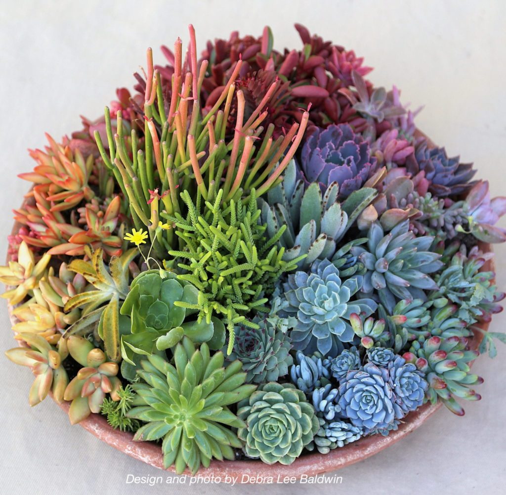
Whether you’re putting together an outfit, decorating a room, designing a company logo, or planting a garden, you are choosing and combining colors. You likely have some colors you gravitate towards and others you avoid working with. I have no interest in talking you out of your favorite colors or color combinations. If color theory does not support a color combo you love — keep on loving it! Don’t think of color theory as a series of rules you *should* follow, but as strategies you can choose to use. Because I do want to help you to be more confident in choosing and using all the colors of the rainbow. As this gorgeous succulent arrangement by Debra Lee Baldwin demonstrates, there are succulents for every point on a color wheel. So let’s see how basic color theory and using a color wheel can help us to get them play well together!
What is Color Theory?

Before we explore color theory and using a color wheel, let’s first define our terms. Basic color theory is the science and art of mixing and combining colors. It includes guidance and strategies for color combinations, and it explores the effects of colors on the human psyche. Aristotle developed the first recorded color theory, and it dominated for over 2,000 years, until Isaac Newton “discovered” the visible spectrum of light. Where Aristotle believed that colors were sent from God in beams of light, Newton proved that beams of “white” light could be broken into the colors of the rainbow by passing it through a prism.
By observing that the colors pouring from the prism always arranged themselves in the same order, Newton identified the colors as Red, Orange, Yellow, Green, Blue, Indigo and Violet, (or ROY G BIV). Not only did he find a way to disassemble white light into its component colors, he developed a way to reassemble it back into white. When you arrange the colors on a wheel, and spin that wheel very quickly, the colors blend back into white. You can watch a great demonstration of this phenomenon and learn to create your own here.
The gorgeous photo above demonstrates the power of color theory and the first color scheme we’ll be looking at — complimentary colors. Note how the predominant colors in the photo are blue and orange, opposites on the color wheel. Let’s take a look at using a color wheel to find pleasing color combinations.
Using a Color Wheel ~ Complimentary Colors
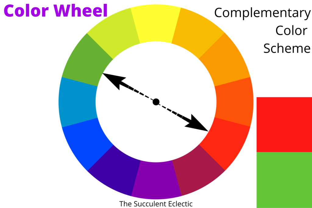
This is a simple color wheel. There are many, far more elaborate color wheel tools available, and color apps, too. But this is a good one for introducing basic color theory and some of the simple color schemes. Assume the arrows in these illustrations are fixed in reference to one another, and imagine turning them through the color wheel. Each combination you find that way works within the color scheme. This simple color wheel uses just primary, secondary and tertiary hues. We’ll define and distinguish between hues, tints, tones and shades later in this post. For now, understand that when I refer to “green”, (or any other color on the wheel) it can mean alllllll the many shades and tones of green, (evergreen, hunter, chartreuse, sage, etc.) essentially occupying the same space on this basic color wheel.
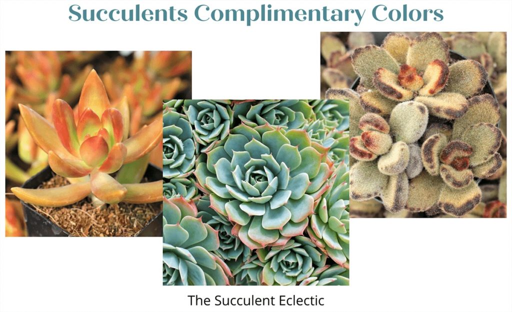
Basic color theory tells us that complimentary colors always go together. Complimentary colors are directly opposite one another using a color wheel. Red and green is perhaps the most recognizable complimentary color combination. From traffic lights to Christmas, the color combo is often used. Purple and yellow for Easter, blue and gold are so popular for school colors. You can create a complimentary color scheme, confident that the colors go well together, any time you pair colors that are opposites on the color wheel. Because they are opposites, complimentary color schemes are high in contrast and tend to be dramatic.
So, any time you have a color and are unsure what to pair it with, take a look across the color wheel! With succulents, you might pair a red plant with a green pot, or a red plant with a green plant, or …
Using a Color Wheel ~ Triadic Colors
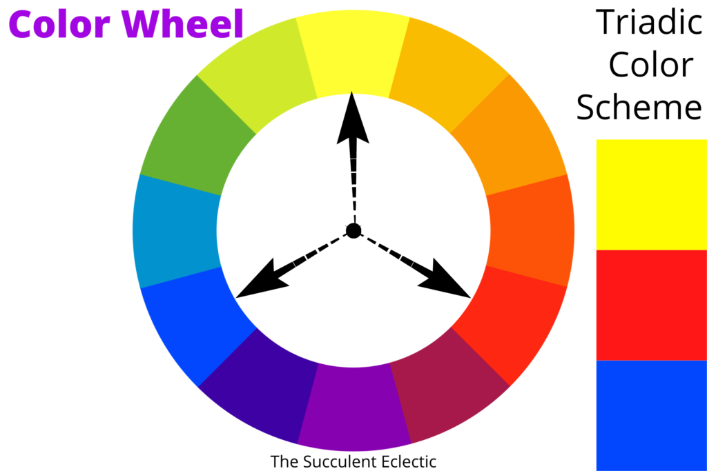
A triadic color scheme chooses three colors that are spaced equidistantly around the color wheel. Although I have illustrated it using the primary colors yellow, red and blue, you can turn the arrows in the center of the wheel in either direction, and find that all triads work just as well. While a triadic color scheme is made up of three colors, there is no need to display all three colors in your design. Any two of the three triadic colors will harmonize with one another beautifully.
With succulents, you might choose to pair a red plant and a yellow one with a blue pot. Or use just the red and the yellow plants in a neutral colored pot. Or spin the arrows and pair green, purple and orange! The high degree of contrast in a triadic color scheme is dramatic, but not as much so as the complimentary colors. The closer the colors reside on the color wheel, the less contrast (and therefor, less drama) there is in the combination.
Using the Color Wheel ~ Analogous Color Scheme
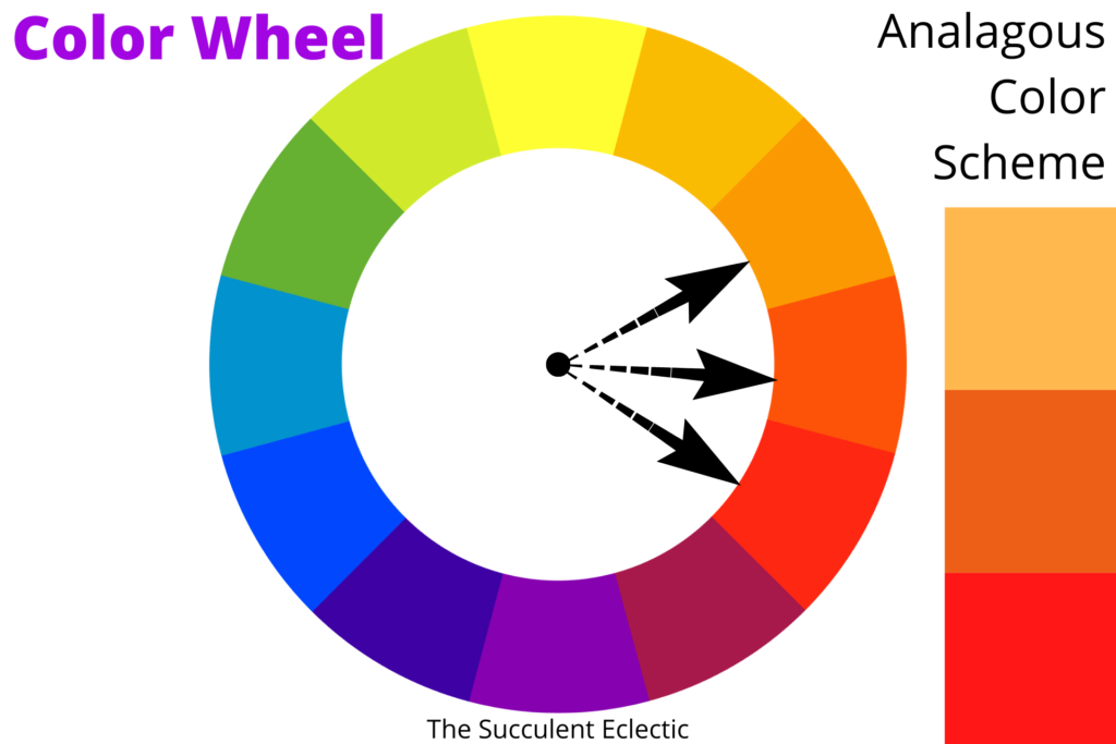
An analogous color scheme combines three colors that reside side by side on the color wheel. This would group orange, orange-red and red together, or yellow chartreuse and green, etc. Because each set of analogous colors is closely related, there is far less contrast in this color scheme than in a complimentary or a triadic color scheme. I think this is the perfect color scheme to start with when you have colors that make you uncomfortable. For instance, although I absolutely love the bold orange color of Sedum nussbaumerianum, I am not at all confident in how to use it. So I chose an analogous color scheme for the succulent arrangement for this post. That way, I could combine orange with yellow and red for a color scheme guaranteed to be harmonious, but with less drama and contrast, it was easier for me to work with.
But, wait! Did you catch that? If an analogous color scheme involves three neighboring colors on the color wheel, why is yellow, orange and red an analogous scheme, right? Take a look again at the color wheel. A tricky part of analogous colors is that they still work, if you pull the arrows closer together or push them farther apart, so long as the arrows continue to have the same distance between them. So, yellow, green and blue work as well together as yellow, chartreuse and green do. But, remember that when the colors are further apart on the color wheel, they have a greater contrast and the combination has more drama.
Of course, there are many more color schemes and combinations described in color theory, just as there are roughly a zillion more colors! But these three schemes, Complimentary, Triadic and Analogous are perfect to start with to gain confidence in pairing and combining colors.
Color Theory ~ Hues, Tints Tones and Shades
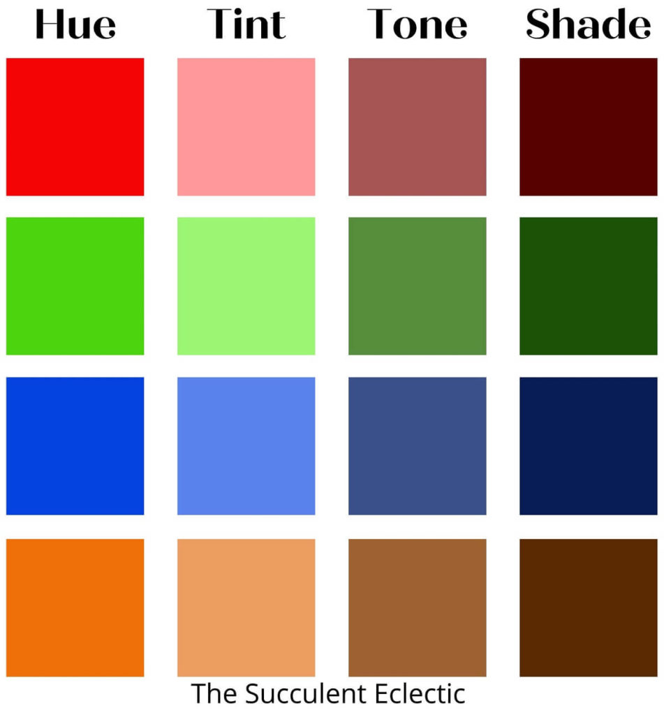
Basic color theory and the color wheel encompass all colors. Although the simple color wheel I have used for illustration only represents 12 hues, it represents all colors in all their dimensions of hues, tints, tones and shades. These related terms are often used interchangeably, but each has a specific definition in basic color theory. And all the color schemes we have discussed work just as well when we bring in all the rich diversity of color. First, let’s see what these terms mean:
- Hue – A hue is a pure color, as it appears on the color wheel. All colors are made up of at least one hue, sometimes more. Red, orange, yellow, blue, indigo and violet are hues. Blends of two pure hues, like yellow-green, or red-orange are also considered hues.
- Tint – A tint is a blend of any pure hue with white. Pastels like pink, sky blue, lavender, etc. are examples of tints.
- Tone – A tone is the result of blending any pure hue with grey. Slate blue and sage green are examples of color tones.
- Shade – A shade is the result of blending any pure hue with black. Navy blue, forest green and burgundy are examples of color shades.
The illustration above demonstrates how much a color changes from hue, to tint, to tone to shade. No matter how much white you add to a hue, the result is always a tint. Likewise with tones and shades. It is by combining the ROY G BIV colors with one another, white, black and/or grey that we achieve all the zillions of colors in the world. Yet the simple rules we have learned about combining colors still work, whether we use the 12 colors of the basic color wheel or every tint and shade imaginable. Every variation of green harmonizes with every variation of red. Imagine sage green and burgundy, or chartreuse with pink, or pale green and burgundy, ad infinitum. Look at the colors above, and mentally rearrange them. You’ll see that light blue and dark brown go together well, as do the tint of red with the shade of green. If there is a color that makes you uncomfortable, consider the tints, tones and shades of the same hue — they might be easier for you to work with! And when you combine several tints, tones and shades within the same hue, you are using a monochromatic color scheme. See how each row is made up of the colors that harmonize together?
Free Color Wheel Tool Online

You might be interested in checking out Adobe’s free color wheel tool. You’ll notice first that it includes tints, tones and shades. Next, these three different schemes are all analogous, each one centered on orange. By playing with the spacing of the color pickers, and then the tints and tones, you’ll see that you can adjust your color scheme a great deal. You can use it with complimentary and triadic colors and to discover more complex color schemes. The tool is very powerful. Spend some time playing with the settings and controls. Whether you ever put it to serious use, this tool can help you gain confidence in working with colors.
Putting Color Theory Into Practice with Full Sun Succulent Arrangement
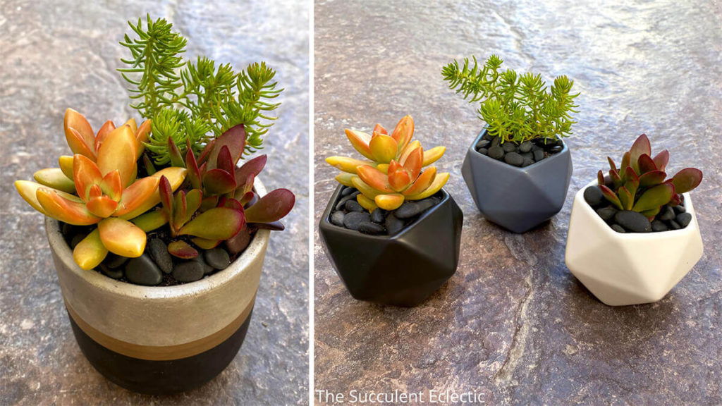
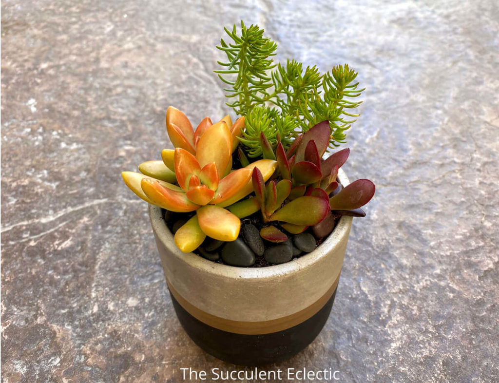
This full sun succulent arrangement is the foundation of the MCG Succulent Trifecta “Playing with Fire”. As always, I designed this Trifecta using a Core, a Complement and a Character. (For an in-depth review of this design approach, please read Introducing Essentials of Succulent Design.) I chose the vibrant orange Sedum nussbaumerianum ‘Orange Delight’ to be the Core of the design, the heart of the arrangement. Isn’t that color fabulous? But I have always been leery of using it, because I was intimidated by the orange! So, I decided to create an analogous color scheme, pairing the orange Sedum with a vibrant red and yellow. I find an analogous color scheme an easier way to work with a challenging color. I chose the deep red Crassula pubescens ssp. radicans ‘Red Carpet’ as the Complement and the (soon to be bright yellow) Sedum Angelina as the Character. Yes, in these photos, Angelina is still a chartreuse green, but in winter, it glows a brilliant yellow that rounds out this fiery triad.
You will note that the shape of the Crassula complements the Sedum ‘Orange Delight’. And the finely cut foliage and semi-trailing habit of the ‘Angelina’ adds a fun texture, or memorable character to the arrangement. But for me, the color is the primary story of this succulent design.
Using a color wheel helped me to tame my nerves about working with a challenging color. I chose to overcome my discomfort with orange by making it the central color of an analogous color scheme. But I could have used orange and one of these blue succulents, for a complementary scheme. Or chosen to work with orange, green and purple for a triadic color scheme. But remember that tints, tones and shades are all fair game in color schemes. You can even choose a monochrome color scheme by using just the tints, tones and shades of a single hue. This might add dark brown, peach and tan to the bright orange. A monochrome color scheme has the least contrast or drama, while the complimentary has the most.
Caring for Full Sun Succulent Arrangement
Just like all the succulent designs I will demonstrate in this series, I selected the plants for this full-sun arrangement to thrive together in the same lighting, watering and climate conditions. The Sedum ‘Orange Delight’ and the Crassula radicans are hardy just to zone 10. So, although the Sedum ‘Angelina’ can tolerate temps far below zero, this succulent arrangement is hardy just to zone 10 (30° F / -1° C). This grouping will thrive outdoors year round if planted in the ground only in warm winter climates. Planted in a container, it should be brought indoors over the winter to protect it from frost.
Each of these succulents thrives in full sun, with the same water needs.
Choosing Succulents According to Basic Color Theory
Many succulents have wonderful colors, and they mix and match beautifully when you use basic color theory. But I wanted to close out this marathon blog post with some handy tips to help you arrange your colorful succulents with greater confidence:
- If mixing two colors is still challenging, try using the tint, tone or shade of the different colors. For instance, the blue of the Echeveria subalpina is paired above with the complimentary colored bright orange Sedum nussbaumerianum ‘Coppertone’. If that pairing is uncomfortable, try choosing a shade of orange (mixed with black, remember?). In the light brown Kalanchoe ‘Teddy Bear’ pairs with the blue just as well, but with less contrast.
- In gardening, all shades of green work as “neutral colors” that mix equally well with any other color.
- Look for other neutral colors among succulents including silver, grey, white, brown and even “black”.
Design a Full Sun Succulent Arrangement Using Color Theory
I have chosen 45 succulents that display bright colors, that all thrive in full sun and share similar watering conditions. I have divided them into Core, Complement and Character. You might disagree with the way I have categorized them, but this will get your started. Are you ready to try your hand at designing succulents using a color wheel and basic color theory?
Have fun!
Core Succulents for Full Sun
The Core succulent is the heart of your design. It is the star of the show.


Complement Succulents for Full Sun
Choose the Compliment succulent for its ability to enhance the beauty of the Core.


Character Succulents for Full Sun
Character succulents coordinate with the Core and the Complement to add whimsy and memorable texture to the arrangement.


I hope you found this blog post informative. What have you discovered using a color wheel? Will you use color theory to gain more confidence using color now? I would love to hear from you! Or let me know if you still have questions or stumbling blocks! Please leave me a comment and let me know! I will get right back to you.
Have fun with your colorful succulents!
For more succulent care information, subscribe to The Succulent Eclectic! I’ll send you my FREE e-course, 7 Steps to Succulent Success. Thanks!
P.P.S. Why not join my Facebook Group for succulent lovers? We talk about succulent care, propagation, succulent identification, and design. It’s a warm and welcoming group that would love to meet you!
P.P.S. Why not join my Facebook Group for succulent-lovers? We talk succulent care, propagation, identification and design. It’s a warm and welcoming group that would love to meet you!